Urban Voice University Project
Photoshop
AI
Visual Design

Project Overview
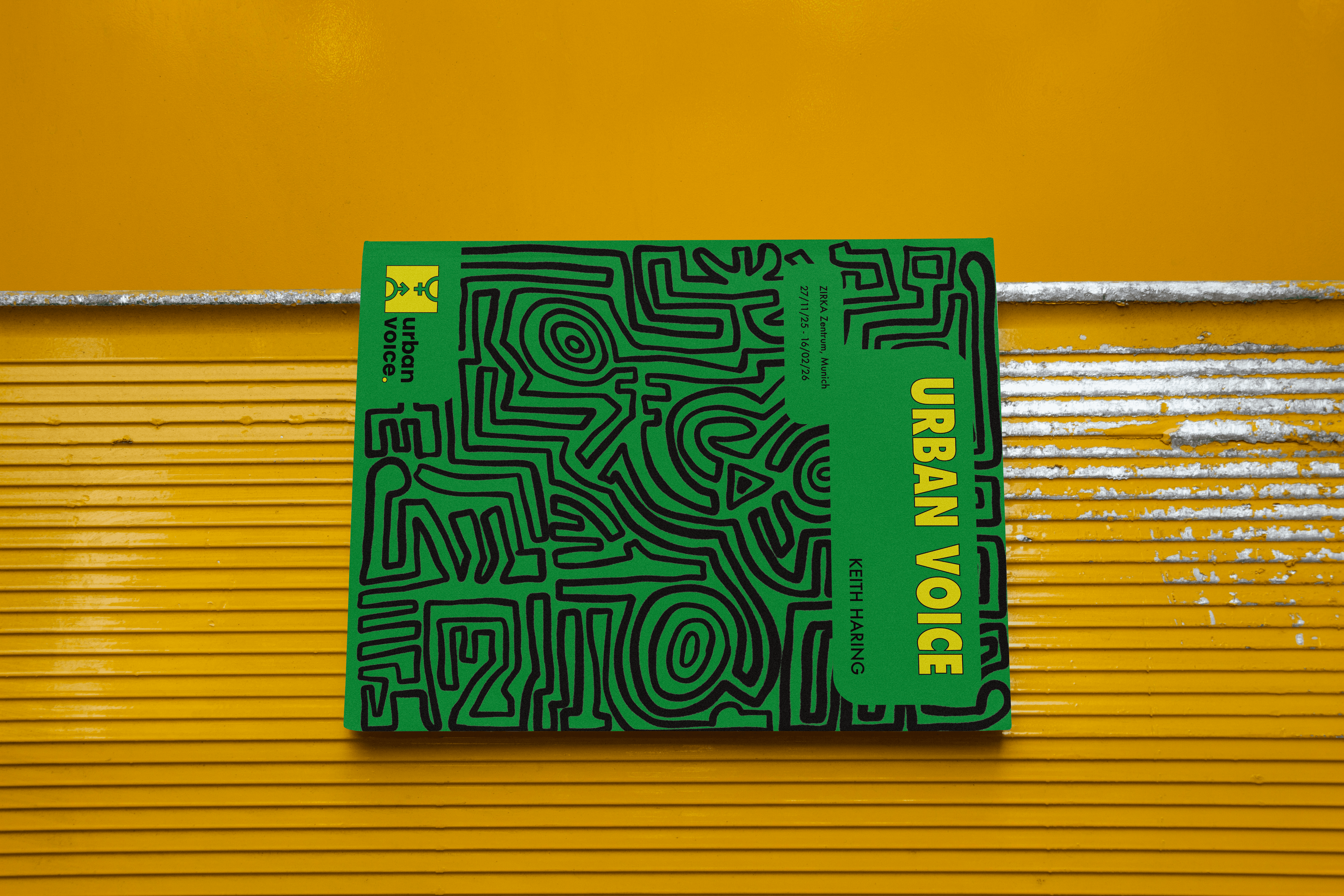
The project required a thoughtful design approach and a strong sensitivity to artistic legacy. I developed the visual identity for a fictional Keith Haring exhibition, including a custom exhibition logo and catalog cover. Since Keith Haring was one of the first artists who inspired me and shaped my entry into the art world, the project held personal significance.
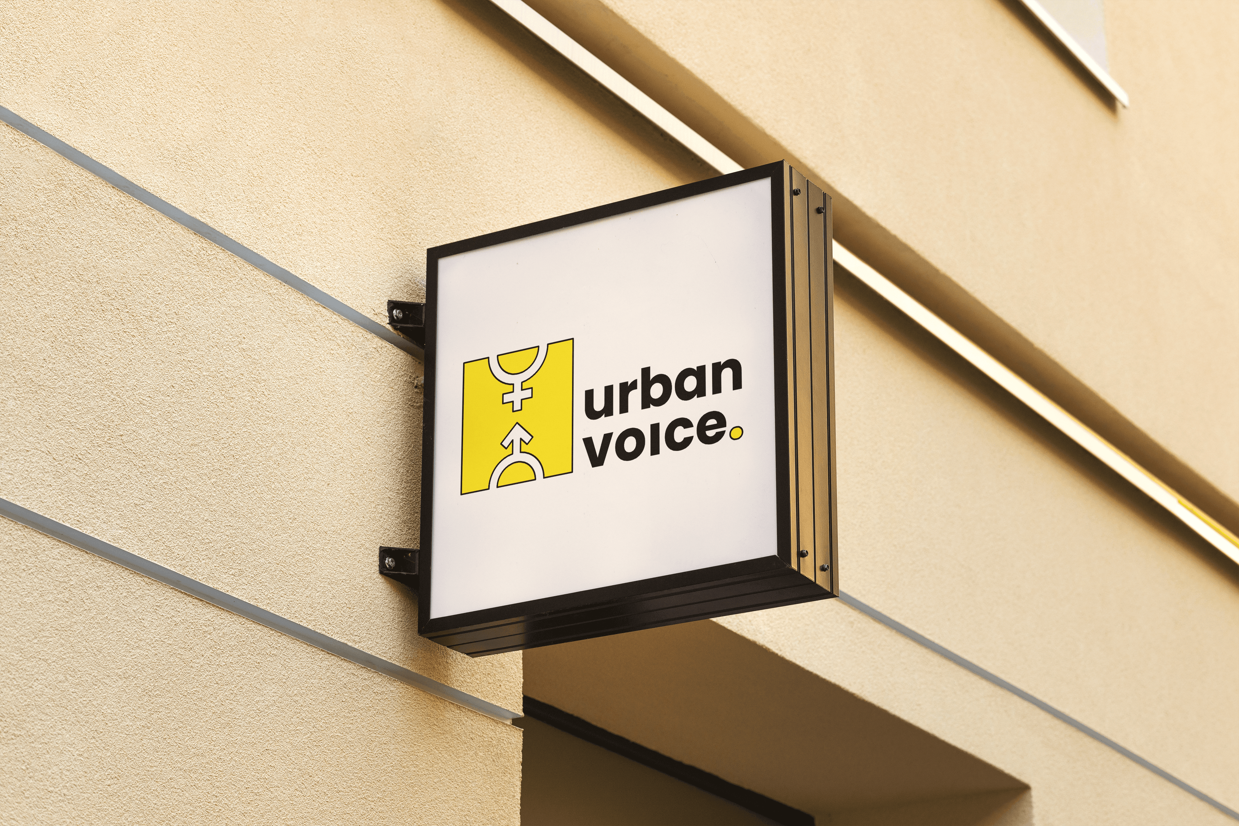
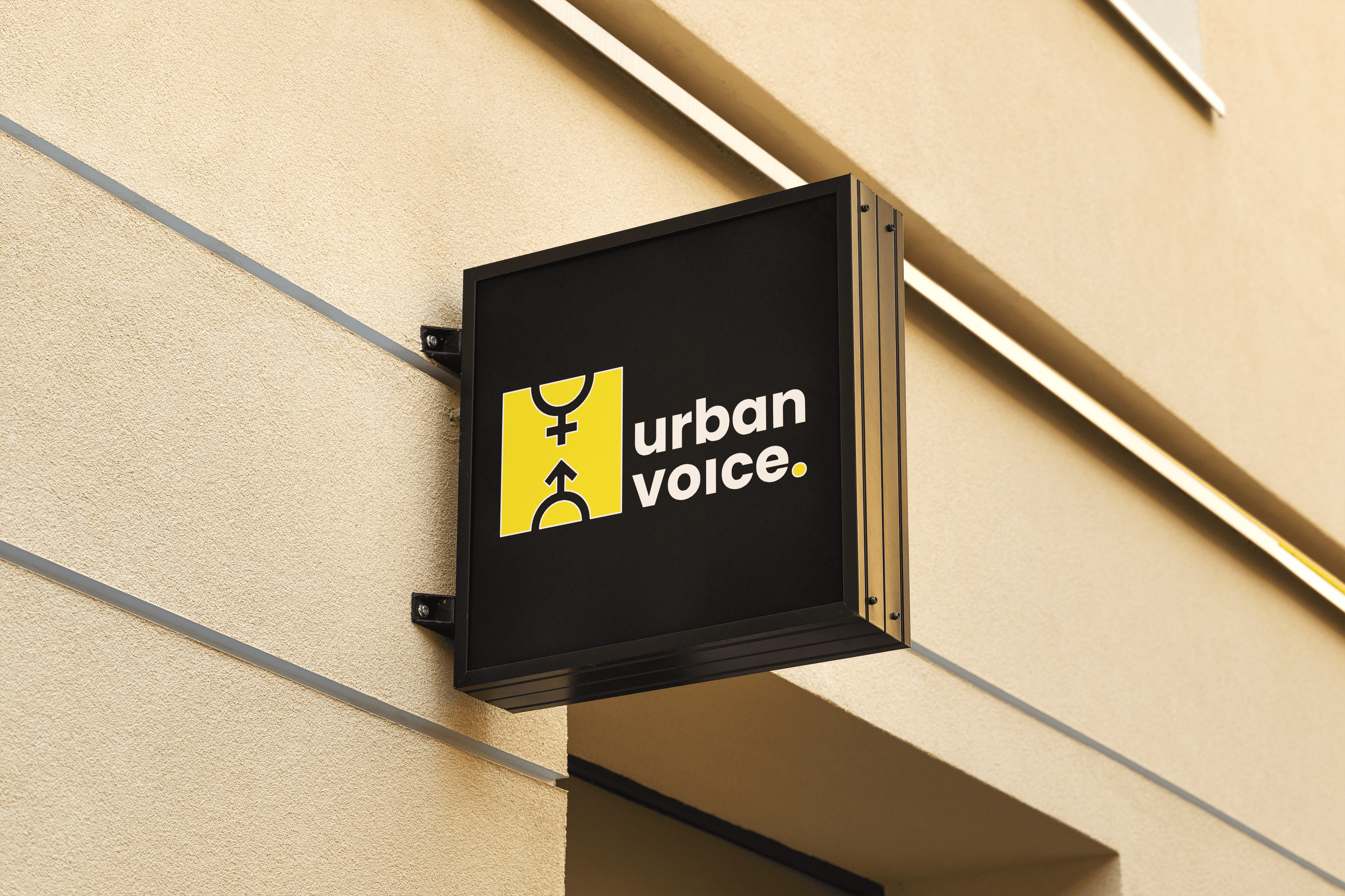
The challenge was to create a logo that communicates his artistic spirit without using his iconic figures or symbols. Instead, I focused on translating the essence of his visual language — movement, rhythm, and cultural energy — into a new, contemporary graphic form.
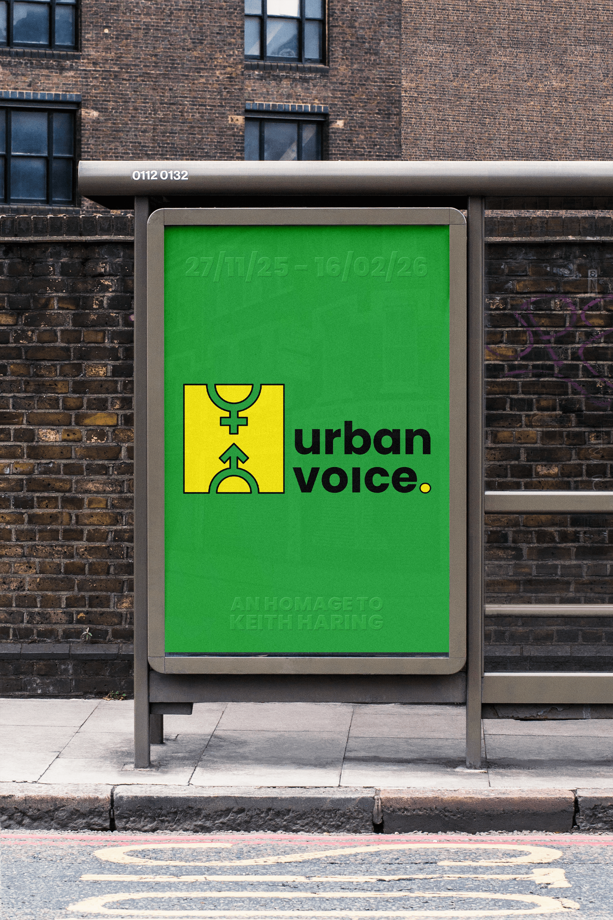
To complete the identity system, I designed the catalog title layout, ensuring that typography, composition, and color reflected the exhibition’s concept. The result is a visual identity that honors Haring’s influence while maintaining a respectful distance and an original perspective.

Creative Process
What made this project particularly exciting was the conceptual depth behind the logo development. The final logo merges the male and female symbols, which together form the letter H for Haring. This combination was selected intentionally: it reflects inclusivity, equality, and the presence of multiple identities, which aligns with the spirit of Keith Haring’s work and his cultural impact.
Throughout the process, I explored numerous logo sketches and directions — many of which were strong in their own right. The challenge was not just to create something visually compelling, but something that carried meaning. The inclusivity concept ultimately provided the clarity needed to make a confident final decision.
This project pushed me to think critically about visual symbolism, abstraction, and the balance between homage and originality.
Final Thoughts
Urban Voice was one of the most challenging and rewarding projects I’ve worked on so far. It pushed me to think further outside the conventional, to question initial design instincts, and to keep refining until the concept felt both meaningful and visually strong. Through this project, I learned the value of patience and iterative experimentation — how taking the time to explore, adjust, and rethink can lead to a more thoughtful and impactful result. I am genuinely proud of the final logo and the conceptual depth behind it, and I am pleased to say that the project was graded 95 out of 100, reflecting the dedication and care invested throughout the process.